Good commercial architecture requires an inviting exterior. What viewers see first should be enticing enough to bring them through your front door. That first impression should tell them something about what happens behind the façade, and it should be memorable. Your business’s sign is more than just the lettering and logo hung on your building. It is the entire façade. If well designed, it will be a powerful advertisement for your business.
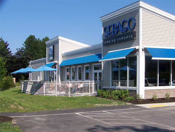
Sebago Brewing Company, a popular microbrewery in Portland, Maine, is a good case in point. The company asked us to design a signature building that would seamlessly blend the brewing and dining parts of their business. Located along busy Payne Road in Scarborough, the brewpub is within a stone’s throw of Maine Mall. The side facing the road, with its bright blue awnings, blue lettering, and blue umbrellas, conjures up an impression of casualness, relaxed fun, and refreshment, which is exactly what patrons will find inside. The building’s unique look and its message easily register in the minds of passing drivers, even as they zip along at the normally hectic pace of Payne Road traffic.
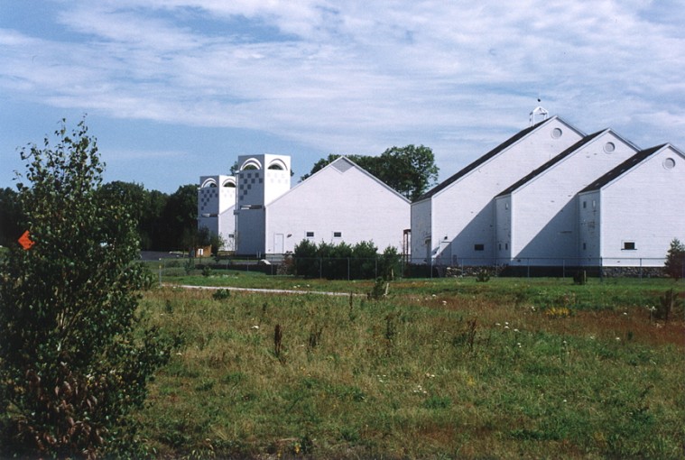
We designed the buildings at Freeport Crossing to catch the eye of passersby traveling at 65 mph on nearby route I-295 and encourage them to leave the highway to enter the complex. Agricultural barns seemed like an appropriate inspiration for large buildings sited in a wooded area on the fringe of Freeport. Contemporary details — glass curtain walls, minimal overhangs and steel trellis — tell you that it is more than a big box, that the shops inside are sophisticated and up to date. (Note: the appearance of this retail complex has recently been changed by a new tenant.)
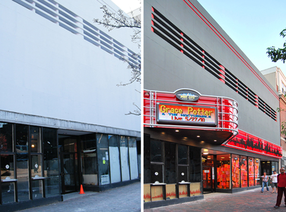
A more urban façade treatment is Port City Music Hall on Congress Street in Portland. The original building had been renovated several times and left distinctively Miami Modern, which is an uncommon look for Portland Maine. We decided to build on that, however, using red paint to highlight the banded horizontal windows and designing a marquee that was inspired by the grill of a ‘53 Chevy truck. Vertical black bars represent computerized musical notes; an LED sign tells you who’s playing. We worked closely with a sign fabricator, providing structural and lighting design, computer modeling, working drawings and navigating through city approvals.
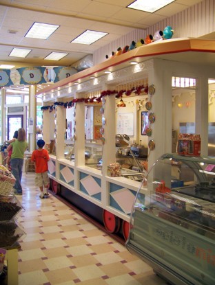
Dickinson’s Candy Shop at 42 Old Orchard Beach involved façade redesign and layout of the retail shop. The existing flat-roofed, single-story building had been extensively remodeled, and the new owner had begun a variety of building improvements. Working with the District Review Committee, we created a building façade that used the post-1907 fire code vocabulary as a reference. Parapet detail, large areas of glass, a proportional bay system, signage, and lighting combine to create a composed storefront. The transparent building front invites viewers to enter and then linger over the colorful displays and candy visible within.
Whatever your commercial building needs may be, from new constructions to major renovations to interior fit-ups, give us a call. We would love to talk with you about working on your next project.


