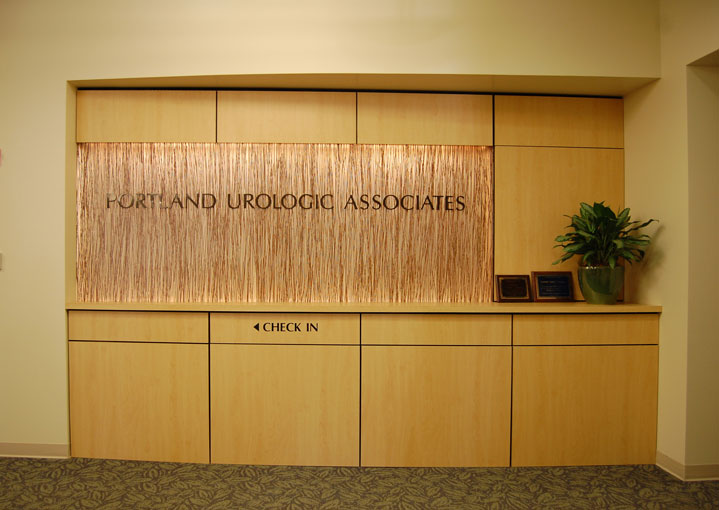
Two major concerns have influenced our work in healthcare design since 1992: the experience of the patient and the efficiency of the providers. Recent trends towards more comprehensive and coordinated care, greater use of a team approach, flexible staff space, private patient consultation areas, and comforting and easily navigated interiors, as in the PCMH (Patient Centered Medical Home) model, reinforce these concerns. Generic plans, in our experience, rarely work. Every practice is different. There’s no substitute for learning intimately how each practice operates. Working closely with you and your staff to optimize plans for present and future is essential to our approach.
Like the ever shifting political and business aspects of healthcare, the physical spaces that deliver healthcare in this country are constantly evolving. Changing ratios of staff to doctor, and increasing use of specialists, assistants, nurses, coordinators and teams require new and more flexible arrangements of rooms and work spaces. The value of friendly and reassuring environments and of seeing each visit through the eyes of the patient is increasingly important. At the same time, there is mounting pressure to process each patient as quickly and efficiently as possible.
The right physical layout is essential to improving the effectiveness of your practice. It will benefit by implementing general trends, but chances are it needs more than a generic design. Each practice and each location has its own demands. Patients and medical professionals have different expectations in a rural setting than in an urban setting; buildings that work in one part of the country are usually not suitable for another. Room arrangements that work for an orthopedic practice are not the same as those for a cardiology practice. Large offices have different demands than small offices.
Yet all good medical buildings have characteristics in common. Some features we have incorporated in our healthcare spaces are interiors that are comforting to the patient and efficient for the caregiver, and public and private areas that are clearly defined. Small offices often need a sense of openness without compromising privacy. Large practices need to be broken down into manageable pods, with memorable signals to aid in navigating corridors. Introducing daylight is one of the best signals and one of the easiest ways to improve the mood of both patient and professional. Places for staff to meet and compare notes are important, and may be as simple as alcoves in a corridor where a doctor can take notes or read x-rays. In some areas, standardized layouts are valuable; keeping exam rooms and procedure rooms identical often helps with efficiency — you don’t want to have to think about where to look for a piece of equipment.
Exterior image is important. While the right image varies depending on location, it needs to represent the nature of the practice inside, it needs to be familiar or interesting enough to be inviting to the people who will use it, and it needs to indicate that the business inside is professional and up-to-date.
During more than twenty years of designing many healthcare facilities, one lesson we’ve learned is that there’s no substitute for taking the time to learn all about how your practice works. We interview the staff, as well as the doctors and the practice managers. We observe the daily workings of each practice and look through the eyes of the patient at the experience of being treated. We establish a program and then put the pieces of the puzzle together in clearly understood models. Finally, we translate the theory to physical reality. Doing that effectively and elegantly is the best thing we can do for your practice.

